
Apple’s widely-adopted iOS 26 update is drawing mixed reactions from users,with the new “liquid Glass” design proving notably divisive.While offering a fresh aesthetic,the translucent menus and increased animations are reportedly impacting readability and causing distraction for some iPhone users. however, as detailed below, a series of adjustments within the device’s settings can help mitigate these issues and restore a more familiar user experience.
A new feature in iOS 26 is drawing criticism from users, but thankfully, a few adjustments can alleviate the issue.
Read on below the advertisement
Weekly Apple News in Your Inbox
Table of Contents
Receive the most important Apple news, deals, and helpful tips for your iPhone, iPad, and Mac every week!
Your submission could not be completed. Please try again later.
Users Are Strongly Disliking This Feature
After a prolonged rollout, Apple has begun pushing iOS 26 to users, meaning the update is no longer hidden within settings but actively encouraged on iPhones. This has led to a surge in installations, but also a wave of complaints.
The most significant source of dissatisfaction within iOS 26 is the new Liquid Glass design, according to feedback from readers. The design introduces a translucent glass effect to all menus and buttons, which many find compromises readability. Furthermore, the addition of numerous new animations has been described as distracting and overstimulating.
There’s Good News, Too
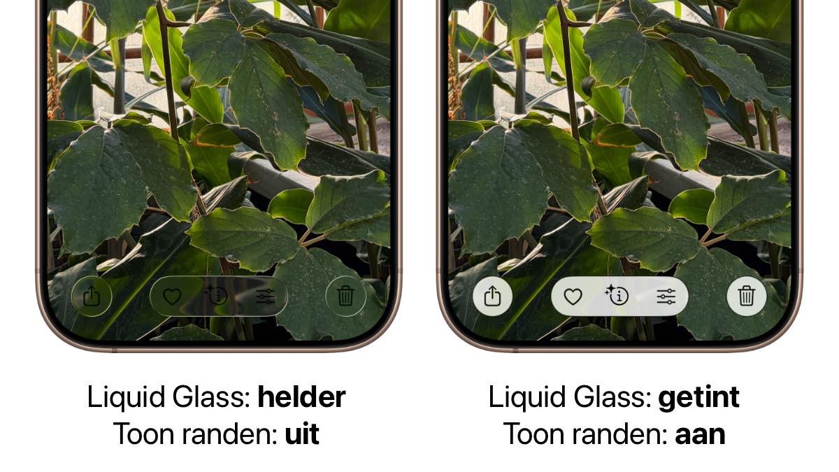
Fortunately, the design of iOS 26 can be adjusted. A few settings tweaks can reduce transparency and tone down the animations. In some apps, like Photos, this can be the difference between unreadable and clear – as demonstrated below.
Below, we’ll walk through six key settings that can make the design of iOS 26 less disruptive. Experiment with these options to find what works best for you!
Fix the Design of iOS 26
-
1
Glass Effect
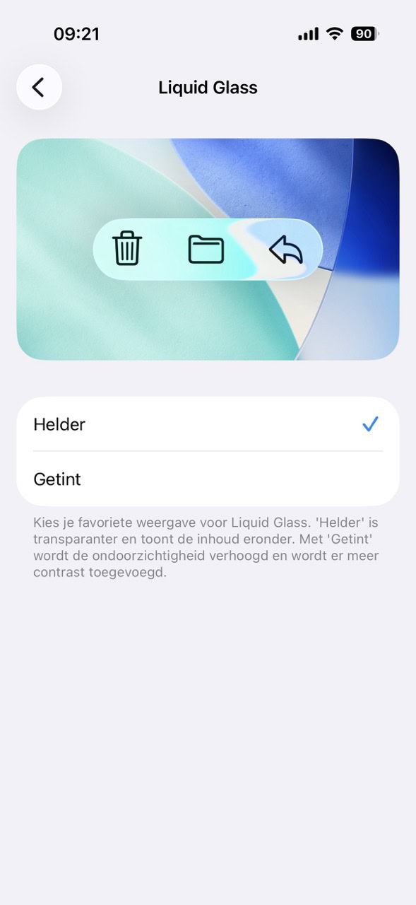
The glass effect in iOS 26 can be significantly reduced with the ‘tint’ option. This gives all those transparent buttons and menus a white or black wash, increasing contrast. You’ll find the option in ‘Settings > Display & Brightness > Liquid Glass.’
-
2
Edge
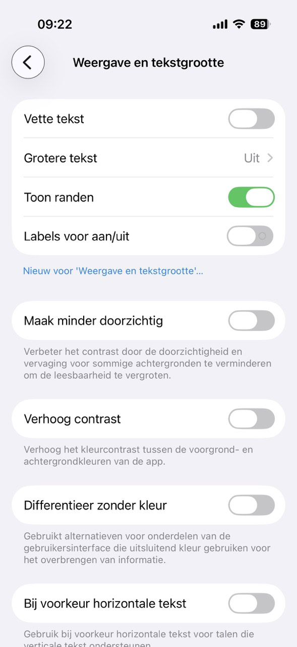
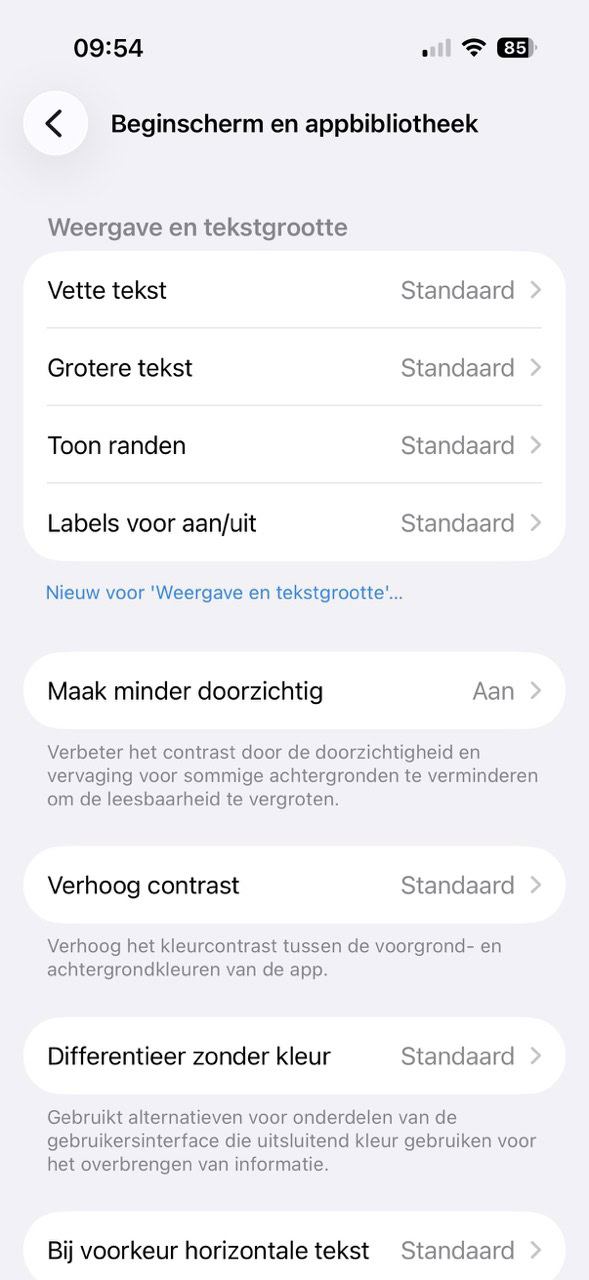
You can give all buttons and floating menus an extra edge, creating more contrast with the background. This looks much clearer. The option is hidden in ‘Settings > Accessibility > Display & Text Size.’ Turn on the switch next to ‘Show Edges.’
-
3
Less Transparent
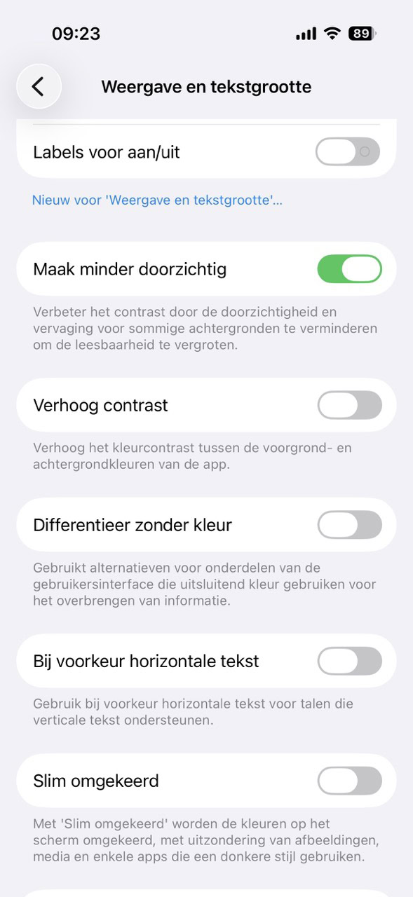
In ‘Settings > Accessibility > Display & Text Size’ you’ll also find the option ‘Make Less Transparent.’ This disables many transparent elements. This is particularly noticeable on your home screen, where your Dock and folders are less transparent, and in apps, where the top and bottom of your screen are no longer blurred.
-
4
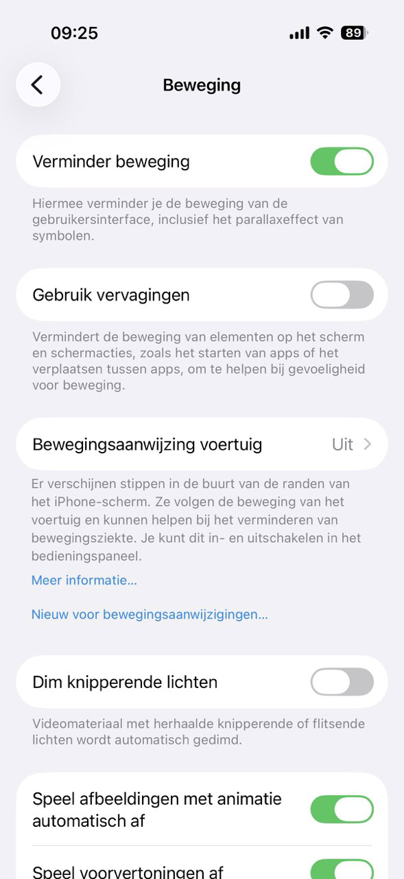
Reduce Motion
For those who find the animations in iOS 26 too overwhelming, there’s the ‘Reduce Motion’ option in ‘Settings > Accessibility > Motion.’ This replaces many restless animations with a simple fade-in.
-
5
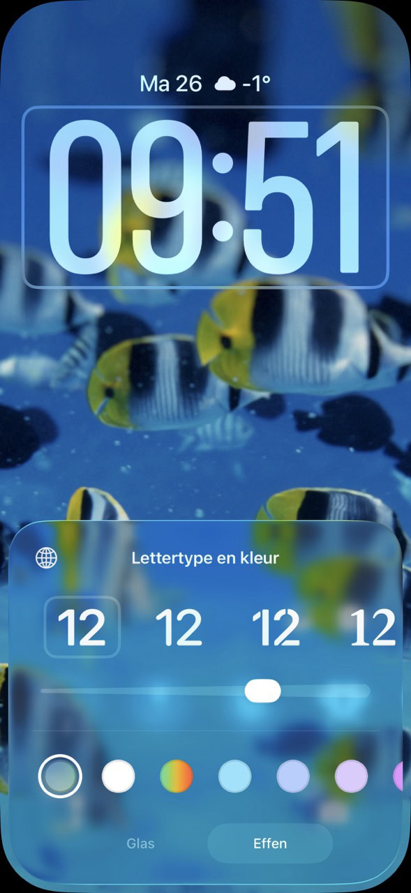
Fix Your Clock
The clock on your home screen can also be made less transparent. Unlock your iPhone, swipe down from the top to show your notifications, and long-press your lock screen. Then tap ‘Customize,’ tap your clock, and choose ‘Solid’ at the bottom. Save it with ‘Done.’
-
6
Per App
You can also apply the accessibility settings from steps 2, 3, and 4 on a per-app basis. For example, if you want less transparency in the Photos app, but not in other apps. You can even adjust the settings separately for your home screen. You control this in ‘Settings > Accessibility > Per App Settings > Add App.’
More Tips to Fix iOS 26
Weekly Apple News in Your Inbox
Receive the most important Apple news, deals, and helpful tips for your iPhone, iPad, and Mac every week!
Your submission could not be completed. Please try again later.